
Canva Resume Templates: The Resume I Almost Sent
Just a few years ago, while preparing to start applying for jobs, I found myself fascinated by something simple. I had two copies of my resume on my laptop. Everything was the same there – skills, experience, and credentials – but one document was hard to perceive from the very first moment, while another made a completely different impression.
It was all about the design.
The first resume seemed cramped and difficult to scan. The second one was designed using Canva Resume Templates, and everything was readable at first sight. It was easier to spot headings, everything seemed proportionate, and no element could distract from reading.
This was when I realised how important a part good design is. It makes your experience more understandable.
I have edited my resume a number of times since then, used various Canva templates, and learned what makes a resume readable and what makes it even more complicated. Here are the design tricks that worked for me. Hopefully, they will help you avoid all the experiments that led to that conclusion.
Before We Start: The True Way Recruiters Scan Resumes
The first thing that influenced my approach to resume design is the way recruiters read it.
Firstly, I believed that recruiters studied each resume line by line. However, after speaking with several hiring managers and reviewing my friends’ resumes, I realised it was not the case. Usually, before becoming familiar with the actual resume content, recruiters try to gain a general understanding of the candidates, their field of activity, and whether they have the necessary experience for the desired position.
This initial reading takes no more than a few seconds.
In those few seconds, your resume answers the silent questions of the recruiter.
Can I easily understand this candidate?
Can I see their experience without looking hard?
Is this resume organised?
If the answer to all three questions is yes, the recruiter is much more likely to continue reading it. Otherwise, even if there is a neat experience on your resume, it may simply be ignored because it’s hard to find one of the main reasons why I started paying attention to resume design.
10 Resume Design Tips That Changed the Way I Build Resumes
1. I No Longer Looked for the Best Canva Resume Template
At the very beginning, I fell into the same trap when I started working with Canva. Instead of choosing a template that would be more legible and clear, I decided to pick a template that looked the most impressive.
There were templates with bright colours, cool graphics and unusual layouts. They looked good on the screen, but when I added my own data, the resume became too cluttered. The experience I had was present, but not so easy to spot.
Having tried several resumes, I shifted my approach.
No longer asking myself “which one is the most beautiful?”, I started wondering “which one makes my experience more understandable?”
It helped me a lot in choosing better Canva Resume Templates.
In today’s time, I am looking for a template with a neat layout, clear heading sections, white space, and a natural flow from the candidate’s name to their experience, skills, and educational qualifications. While it is not one of the most attractive designs available on Canva, it definitely performs much better when someone is browsing through a resume quickly.
Also, I have started using templates specific to each application I am sending it to. While creative templates can really suit jobs of graphic designers or content creators, they look quite out of place when you are applying for jobs in corporates, finance and administration fields.
Criteria I Consider Before Selecting a Template
Instead of instantly installing the first template that comes into view, I look into the following features:
- Headings are clear.
- Sufficient spacing exists between paragraphs.
- The font is easy to read.
- The design is well-balanced and not overloaded with unnecessary elements.
- My experience is always the key point on the page.
- The selected template remains professional even after all my data is entered.
And one important thing I learned from this editing experience.
Your experience will always be remembered by the recruiter much earlier than the template you used. The best template simply helps them to locate your experience
2. Design Means Elimination Of Distractions
For quite some time, I have had an impression that the way to a great resume lies through adding more items to it. More symbols, more colours, more design features, and more sections.
The opposite happened.
The more I added to my resume, the harder it was to read. My achievements began to be overshadowed by design features, and although the text was great, the design made it difficult to read.
This became the turning point in my resume writing process.
Good resume design should not involve adding more features. On the contrary, it should eliminate all features that do not help the recruiter better understand your background.
Nowadays, after completing my resume editing, I always ask myself one simple question.
“Is this element helping the reader, or simply adding visual clutter?”
If the answer is negative, I remove it.
I think it helped way more than experimenting with all the design trends on Canva.
Elements I Stop Using in My Resume
There was a long list of elements I decided to stop using over the years since they looked good but did not bring much value to the resume.
- Big profile pictures
- Shapes
- Skill bars
- Too many icons
- Bright backgrounds
- Borders around the sections
- Accent colors
- Text effects
It became easier to highlight all the important information once I got rid of those.
Now I Do This Instead
Now my resume has a totally different philosophy.
- Plenty of white spaces
- A font pair that is easy to read
- Clear headings of the sections
- Spacing consistency
- Accent colour in case I need one
- Icons only for contact info
The idea is not to make my resume blank. The idea is to make each section easy to scan in just a few seconds.
A lesson I have learned from the process of remodelling my resume is that there are very few instances in which a recruiter may discard your resume because of its simplicity. In most cases, it’s when it appears to be too complicated.
Each time I work with Canva Resume Templates, I spend as much time removing elements as adding new ones. That little practice has enabled me to create resumes that look more professional and are easier to understand.
3. Each Section Must Answer a Specific Question
Another problem I had with my resume was treating all sections equally. I just added some information in them without considering what a recruiter wanted.
But now, when I look at my resume, I know that each section must serve one function: to answer one specific question.
| Resume Section | The Question It Should Answer |
|---|
| Contact Details | How can I reach this person? |
| Professional Summary | Why should I keep reading? |
| Work Experience | What value has this person delivered? |
| Skills | Do they have the abilities I need? |
| Education | Do they meet the basic requirements? |
| Projects or Certifications | Can they back up their skills? |
This simple change helped me remove unnecessary details and focus on relevant information.
In editing Canva Resume Templates, I go through each section as if I am the recruiter. Any section that fails to fulfil its purpose is reworded, or parts of it are removed.
An effectively written resume should not communicate more than it needs to, but rather guide the reader where he or she needs to go.
You May Also Like: How to Use Canva for Beginners: 21 Best Canva AI Tools, Templates, and Canva Teams Features
4. I Started Designing for the First Ten Seconds
There is one practice that has completely shifted the process of my resume evaluation.
Prior to sending an application for any job, I always open the final PDF file and evaluate it in terms of what I can see in ten seconds. If there are any problems with locating my name, relevant experience, key skills, and contact information – something should be done about it.
In this way, I am able to check how the resume looks like from a perspective of the recruiter and not mine.
While using Canva Resume Templates, I pay special attention to making sure that the design is naturally leading the reader through all resume parts. It is critical in ten seconds of the evaluation.
Consider these questions before clicking Apply button:
- Is it clear to anyone what I am doing within ten seconds?
- Are the most valuable resume parts easily accessible?
- Is anything distracting from the experience?
If the answers are yes and no respectively – you are on the right track.
5. White Space Has Made My Resume More Legible
The most significant improvement I have made is not about anything I have added but rather about giving my content more space.
Initially, I used to stuff all the information into a single page, resulting in an overcrowded resume with little relevant content.
Currently, there is enough space left between different headings, bullet points, and other sections of my resume. It not only makes the resume more legible but also helps the reader focus on one part of it.
While designing Canva Resume Templates, I always try to give enough space between different elements before changing the colour scheme and font style of the content. There is no doubt that a clean layout with good white spaces always looks more professional than a cluttered design.
One can simply check it by zooming out and having a general look at their resume.
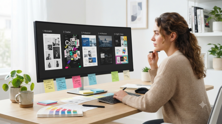
6. I Prepare Multiple Resume Templates
Before, when applying for any job, I would use the same resume. Although this was quite practical for saving time, I quickly realised that each position requires something different.
Thus, I now prepare multiple versions of my resume using various Canva Resume Templates. All the information is usually the same, but the format and the accent may vary based on the position.
For instance:
- Minimalistic template for corporate or office positions.
- Modern template for marketing or IT positions.
- Creative template for design or freelancer positions.
Thus, having several templates helps me save time, as I don’t need to prepare my resume from scratch every time. Moreover, this ensures that I am consistent while remaining relevant to the position.
7. Minor Changes Make a Major Difference
The best changes I have made haven’t been huge. The changes were minor things that people usually don’t see until there is something wrong with them.
Before sending my CV out, I always give it one last check for consistency. I check if the font sizes, spacing, date formats, and headings are all the same.
While working with Canva Resume Templates, it is very easy to get caught up with colors and design, however, such minor things will make more of a difference.
My final checklist goes as follows:
- Use one font type throughout.
- Align everything correctly.
- Format the dates in the same way.
- Space bullet points evenly.
- Use consistent headings.
These changes may take me only several minutes but make the whole CV look neat.
8. My Resume Is Never Final the First Time
I don’t send the first draft of my resume, even if it looks perfect.
I always take some time after completing the design to step back and look at it with fresh eyes, and almost always I find something I have missed – spacing errors, typos, or sentences that could be expressed better.
When editing the Canva Resume Template, I also check how it looks on my laptop and phone – if it’s easy to read across different screen sizes, then the design works well.
When I’m about to submit my resume, I ask myself some quick questions:
Are all accomplishments easy to spot?
Is it easy to read from top to bottom?
Is there any unnecessary information that can be removed without reducing its value?
This last check may take just a couple of minutes, but it has helped me avoid sending imperfect resumes more than once.
9. Finding The Right Balance Between Good Looks and ATS-Friendly
Professional resumes have to be nice-looking but also compatible with ATS if the company has one installed.
When I started working with Canva Resume Templates, I was afraid that everything I did would be problematic for ATS. But after several attempts at different designs, I realised that simplicity is always the key.
Here are some principles I use:
Add clear headings to sections.
Use readable fonts.
Do not put any important information inside images.
Convert your document into PDF at the very end, when needed.
Make sure that your design is neat and consistent.
My purpose is not to find a balance between the two things. A well-formatted resume can do both, and it will not look boring.
10. Your Resume Is about Yourself, Not about a Template
What I have learned better than anything else is that a resume template should complement your resume story.
A lot of people tend to download a fancy resume design and think the task is accomplished. This is what I did before. However, I’ve come to understand that copying sample resume text does not cut it – a great resume should highlight your skills, achievements and position.
Whenever I use Canva Resume Templates, I use them as inspiration rather than as a final product. Thus, I edit the layout and change the text content, deleting everything unnecessary.
Whenever I submit my resume for a certain position, I ask myself one final question:
“Would my experience stand out if somebody deleted the design of the resume?”
And if it were a definite yes, it would mean a resume is ready to go.
Resume Design Mistakes That I Have Made Myself
After reflection, most of my mistakes in the resume have been related to its design, not my experience. They made the resume difficult to view.
These are some mistakes that I learned to avoid:
- Putting lots of info on one page.
- Using various fonts just because you can.
- Adding distracting colors to the resume.
- Writing long paragraphs instead of bulleted lists.
- Not taking enough time to review the resume.
Each of these mistakes alone does not spoil the resume, but when combined, they make it less professional.
Now, each time I update my Canva Resume Templates, I remember only one principle: everything should help with the clarity of the resume.
Correcting such minor mistakes made my resume look clearer and more professional.
Resume Design Myths That I Don’t Believe Anymore
While creating my resume, I have realized that some tips don’t always work.
Some of them include:
Myth: A colorful resume will attract more attention.
Fact: Proper organization is much more eye-catching than any color.
Myth: There is one resume for all possible jobs.
Fact: Little changes make an application more suitable for a position.
Myth: The more design there is, the better the resume looks.
Fact: In many cases, simplicity wins.
Myth: All Canva templates are ATS-compatible.
Fact: It depends on the way you apply the template.
All these facts were obtained through trial and error and not from the checklist. Each time I updated my Canva Resume Templates, I paid more attention to the content than to the design.
And sometimes the best modification isn’t about something new but about making your experience the centerpiece of the resume.
Personal Review Framework for Resume
Before submitting any application, I review my resume for 5 minutes. This process allowed me to find some minor mistakes that are often missed during editing.
Visual Assessment
Is there a proper balance of visual elements on the resume?
Is there enough spacing between different parts of the resume?
Are all the headings used consistently?
Does my resume look good at first sight?
Content Assessment
Does each bullet point contribute to the overall idea?
Did I remove any redundant information?
Are my accomplishments described clearly?
Is it possible to go through the page quickly?
Final Assessment
Are there no grammar or spelling mistakes?
Are all the links working properly?
Is the file named professionally?
Will I be confident to send this resume right now?
When looking at my Canva Resume Templates, I pretend that I am seeing them for the very first time. If something is not quite clear or confusing, I edit it until I click Apply.

Last Minute Tips Before Clicking Apply: Quick Guide to Checking the Resume in 60 Seconds
Regardless of how confident I am about my resume, there is always that one last check I will make before clicking on “Apply”. It does not take much time – about one minute- but it allows me to spot small errors which can be easily overlooked if I look at the same document for hours.
Here is the list of things I do every single time.
- Read through the whole resume once more.
- Double-check all my contacts.
- Verify that all the headings look the same.
- Look for additional space symbols or any other mistakes in the formatting.
- Open the PDF file to see whether everything is right.
- Rename the file with an appropriate name.
Even though this sounds pretty easy, not taking these steps has already led me to some problems in the past. Since this became a ritual of mine, I have become much more confident when sending applications.
The resume is not complete until you go through all these final steps.
FAQs
Are Canva Resume Templates ATS-compatible?
Yes, they can. The template is just one aspect. Clean formatting, clear text organization, good fonts, and simple information placement are also essential. I never include crucial information in graphics or design elements.
Which Canva resume template suits freshers?
If you are a fresher looking for your first job, use a simple resume that emphasizes your skills and certifications.
Should I use colors in my resume?
It is possible. The template is not the only aspect of your resume to consider. Clean layout, proper structure, clear font, and neat content are essential too. I always make sure not to.
Using colors in the resume can organize it and highlight various parts, but they shouldn’t draw attention away from the content.
Can recruiters tell that I used Canva?
Most recruiters care less about what software was used and more about how well your CV is organized and formatted. If everything is clear and understandable, it is unlikely to matter what the program is.
How often should I update my CV?
Each time I finish a project, obtain a certificate, develop a skill, or change jobs, I update my CV.
Is there any need to create separate resumes for different jobs?
In my opinion, there is. I always maintain several versions of my Canva Resume Templates and adjust them for each position I apply for. It usually does not take much time.
Final Thoughts
Reflecting on my experience, I can state that I did not improve the resume because I used another template, but due to the changed perception of the process of resume creation.
Initially, I was concerned with making the resume visually attractive. Then, I understood that its clarity was the top priority, and the shift resulted in an improved visual appearance of the resume.
Do not spend a lot of time trying to find the best template for your Canva resume templates. Just pick up any clean template, tailor it according to your experience, and continuously improve it. Sometimes, several changes have more effect than a full revision.
I wish that my experience helps you avoid some mistakes that I have made. It is not necessary to create the most creative resume in order to impress employers. It is enough to create an effective resume.
Important Note: There can be many versions of a resume depending upon its purpose. In this guide, I have explained some pointers that come from my own experience of designing, testing, and refining my resumes using Canva. It is important to always modify your resume according to the position you are applying for. Do not forget to use authentic sources to keep yourself updated regarding the latest information. The external links provided in this article are only for the educational purposes of readers. Swisspik is an independent website that is not associated with Canva or any other brand.

Canva resume templates are beautiful, free, and easy to use. They are also one of the most common reasons qualified candidates never hear back from employers. The short version: Canva is a design tool, not a resume tool, and the difference costs people interviews every single day. Multi-column layouts, icons, and graphics are ‘noise’ for ATS. It’s fine for handing a printed resume to someone at a networking event, but for online applications, stick to plain text and no graphics