How to Curve Text in Canva: Complete Guide
Introduction: The Logo That Looked Better in My Head
My first attempt at creating a logo with a curve on Canva was sure to be quick – no more than five minutes. A clean font, an easy icon, and the perfect image in mind.
I got something totally unexpected.
I slid the Curve slider practically to the end because a higher curve should make a nicer result, yet the Text looked distorted, the spacing between characters was inconsistent, and the letters were hard to read. On my laptop, it looked okay, but on my phone, the same logo looked unbalanced.
I thought Canva was to blame.
In the following few weeks, while trying out other projects in the program, I realized that the problem wasn’t with Canva itself but with how I handled it.
I tried out various fonts and letter spacing before curving, and even compared the same logo on my phone and laptop. Tiny differences made a big difference in the final effect.
I learned some important lessons from that.
Curve Text is not about excessively twisting letters; it’s about balance. The best Curve Text integrates harmoniously with the overall design, enhancing its appearance without attracting unnecessary attention. terms; it’s about balance. The best Curve Text integrates harmoniously with the overall design, enhancing its appearance without attracting unnecessary attention.
Whether you are designing a logo for your company, a thumbnail for your YouTube channel, an invitation for a wedding party, a presentation for school, or any social media post, some essential design knowledge will help you avoid the mistakes that ruin most Canva designs.
In this guide, I will show you, step by step, how I do that now and teach you about seven mistakes most beginners make, along with fixes that always deliver good results in my Canva designs. Text effect is a feature that lets you use curved lines instead of straight ones when writing text. In other words, instead of using a new font style, the app will curve your text for you.
It may look like a minor design element, but it can transform the entire appearance.
The Short Answer
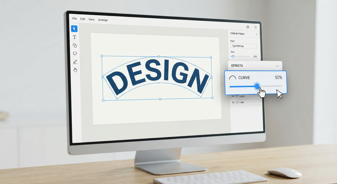
Designing text on Canva may appear easy once you know where the function is located. All you have to do is add a text box, select your text, go to Effects, and choose Curve to adjust its shape. The function is easy to use; certain design flaws that beginners often make during the design process make their text hard to read. In this article, I will discuss the top 7 mistakes I have noticed in my Canva design process and how to fix them.
What Is Curved Text in Canva?
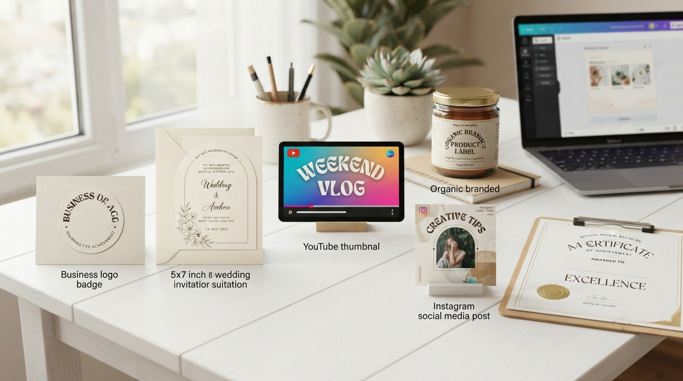
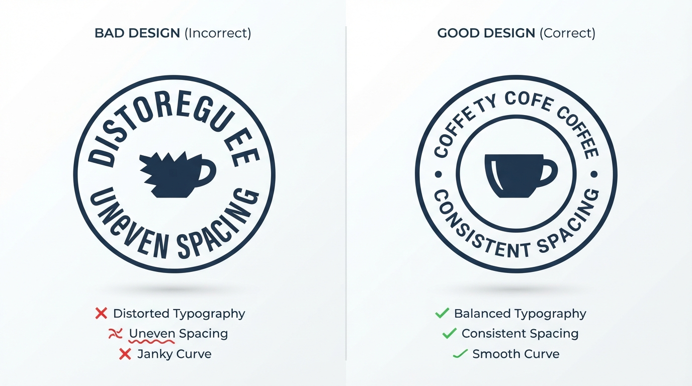
Imagine the logo of a coffee shop. It features an illustration of a coffee cup with the business name inscribed along its contour. This design creates a more harmonious impression compared to logos that display the text in a horizontal line above the image. The same principle applies to badges for sports events, product labels, packaging, diplomas, invitations, podcast cover art, and various social media graphics. It is a versatile option for any project.
If you are creating a document, writing a long paragraph, or working on something where readability is more important than anything else, plain text is your better choice. The curved text works well for short phrases, titles, names, or branding elements. When using Canva projects, it is important to have a reason to use the Curve Text. Just adding this feature doesn’t really enhance your project; it can even distract from its main purpose. Usually, it works better when used with shapes, logos, or other circular layout elements.
You May Also Like: How to Choose the Best Canva Brochure Templates in 2026 (Real Business Examples)
When Should You Use Curved Text?
There is one thing that many beginners find out when they start using Canva, and that is the Curve effect, which they suddenly want to include in all their projects.
Well, I did the same thing.
Gradually, I came to understand that Curve Text is particularly useful when it complements the layout rather than becoming its main focus.
This list includes several cases:
Logos
One of the most popular applications is logos. Many companies, such as restaurants, cafés, sports brands, educational institutions, and other small local businesses, add their names to a circle.
Invitations for Events
Many types of invitations, such as wedding invitations, birthday invitations, graduation congratulations, and other holiday designs, feature Curve Text to outline illustrations or floral elements, making the design look more elegant—an excellent way to emphasize your short headlines or promotions. Used correctly, it provides movement that draws your eyes to the center of the graphic.
Product Labels
Circular compositions are popular for product labels because they look good on jars, bottles, candles, and soaps. Curved text helps you follow the product’s shape, and work against it.
Badges & Certificates
Curved text is used when creating award badges, membership seals, achievement certificates, and educational graphics with circular borders.
In all the cases above, the Curve serves a certain purpose. It works in harmony with the rest of the composition.
Curved Text on Canva – How Is It Done?
Although you might not be very familiar with Canva, curving your text takes only a couple of minutes. The key thing to remember is that you should know what each setting does, rather than playing with sliders until Texttext gets dramatic.
Step 1: Start Working in Your Canva
Firstly, open the project or create a new one.
Remember to choose the right size for your project before placing any text. In a presentation or an invitation, it will be easier for you to place Texttext properly.
Step 2: Insert a Text Block
From the menu on the left side of the Canva editor, click Text to choose either a heading, subheading, or body text type.
Now insert the text you wish to curve.
When creating a logo or badge, use a short phrase. Short phrases are easier to read after being curved and look better overall.
Step 3: Choose the Text
Click on the text box to see the toolbar at the top of the page.
The toolbar offers several options, including fonts, size, color, spacing, and text effects.
Step 4: Open the Effects Panel
A panel opens, having several text effects. You need to scroll down to find the Curve option in the panel.
Step 5: Use the Curve Slider
Once the Curve is selected, Curvea opens a slider to adjust the Text’s Curve—the Text’s Curve.
Rather than dragging the slider to the highest point, move it gradually and observe how the text looks at each step. If you are satisfied with the Text’s Curve, proceed to adjust your Text’s overall appearance.
Step 6: Fine-Tune the Position and Spacing
Position your Text so it fits nicely into your design. When dealing with logos and badges, you should maintain the same distance of your Text from the middle graphics. Small changes in alignment will often have a greater impact than changing the Curve.
Check the SpCurve option next.
A slight increase in letter spacing will be helpful when the Curve is very tight. The Curve must not exaggerate, as excessive spacing may break the connection between words.
Before proceeding, you can zoom out to view your entire design. Many alignment problems become clearer when viewed as a whole rather than individual letters.
Step 7: Preview Design Before Exporting
Another good practice that has helped me avoid endless rounds of revision is to always preview my design before downloading.
Design that may seem perfect at 200% zoom can look completely different at normal size.
If possible, preview your design on both desktop and mobile screens. In this way, you will see any spacing or alignment problems in advance.
Step 8: Export in the Proper Format
When all elements are balanced, it is time to download your design in a proper format.
For web graphics, PNG is your best choice, and its quality is amazing.
For print, use PDF Print for the best results.
If your design requires transparency, you can use PNG Transparency with an appropriate Canva subscription.
High-quality download keeps the nice smoothness of curved Text from becoming blurry.
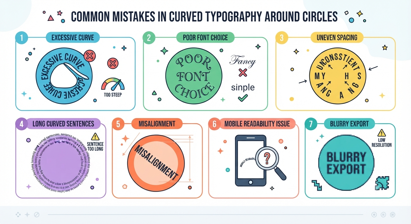
7 Common Errors And How To Fix Them
Knowing the location of the Curve button only partially fixes the problem.
You create better designs by being aware of the minor errors that make curved Text look weird. These are precisely the mistakes I used to make when I first used Canva, and the ones I see beginners make all the time.
Mistake #1 – Curving The Text Too Much
The biggest error beginners make is thinking that more curvature is better.
Instead, it just distorts the text and makes it unreadable.
Quick Fix
Apply the Curve only if your Curve requires it. Start with a small amount.
Example In Real Life
When creating the coffee shop logo, the best option is to curve the cup symbol rather than the whole Text.
Pro Tip
If it takes more than two seconds to read your Text, then the Curve is too much.
Mistake 2: Selecting the Incorrect Font
Not every font will work well when bent.
Fonts with ornamental styles and thick strokes are usually hard to read when curved.
Quick Solution
Select fonts with neat lettering and good spacing.
Modern sans-serif fonts and rounded fonts tModern sans-serif and rounded fonts that are easy to read at various sizes would be ideal. A bakery logo in a simple, rounded font would appear more professional than one in a highly ornamental font.
Mistake 3: Neglecting Letter Spacing
Curved Text will automatically adjust letter spacing.
Some letters will be too close together, while others may have too much spacing.
Quick Solution
Use Canva’s options to adjust the letter spacing after curving it.
Sometimes, tiny changes make all the difference in how readable the Text looks.
Personal Experience
In my designs, I very rarely finish curving the Text without changing the letter spacing. It is one of the things that no one notices until something goes wrong.
You May Also Like: Canva Pitch Deck Templates: The Complete 7 Slide Framework Behind Winning Startup Pitches
Mistake 4: Curving Long Sentences
Long sentences should not be curved in Canva.
It is impossible to make the layout look readable when you try to curve an entire paragraph.
Quick Solution
Save curving for titles, names, slogans, and short headlines.
Let the long texts remain in their normal positions to ensure readability.
Mistake 5: Not Thinking about the Balance
Often, people concentrate solely on the text, ignoring other parts of the design.
Even if the curved lettering is flawlessly shaped, the design will look weird when it doesn’t match the icons and shapes used there.
Easy Fix
Evaluate your creation from a global perspective rather than just checking the text.
Think about all the elements being related to each other.
Real Example
In the case of a circular badge where the Text is placed close to its center, the outer part has a lot of free space, and your design will look unbalanced even if the Curve itself is perfect.
Mistake 6: Skipping Mobile Preview
The layout that looks wonderful on a big screen might be unreadable on a mobile device.
It often occurs with curved letters, as the small font becomes even harder to read on smaller screens.
Easy Fix
Preview your creation on different devices before you print it or publish it online.
I’ve learned that this simple thing helps avoid many mistakes made in the desktop version of the software.
Mistake 7: Exporting Without Verifying the Format Quality
Most people complete their design and then export it to the first available file format.
It will either come out blurred or pixelated, depending on where it will be used. table format for the design in question.
If it is meant for online use, go for PNG; for professional prints, choose PDF Print whenever possible.
The extra few seconds of selecting the format can greatly improve the overall outcome of your design.
Best Fonts for Curved Text in Canva
While there is no single perfect font, some styles naturally follow curves better than others.
| Font Style | Best For | Why It Works |
|---|---|---|
| Sans Serif | Logos and branding | Clean and easy to read |
| Rounded Fonts | Social media graphics | Friendly appearance with smooth curves |
| Modern Serif | Invitations and certificates | Elegant without losing readability |
| Simple Script | Short names and signatures | Adds personality when used carefully |
Instead of selecting the most decorative font available, choose one that remains readable even at smaller sizes.
From my own experience, readability almost always creates a stronger impression than decoration.
Canva Free vs Canva Pro for Creating Curved Text
This particular feature is available to most Canva users and is therefore easily accessible, even if you have just begun using it. This is all you need to understand how to create curved Text and achieve great results.
Canva Pro is handy if you design marketing materials or have other tasks that require additional features.
Solutions When Curve Text Does Not Work
If your work doesn’t seem right, it is quite simple.
The curve feature is not available.
Make sure you have selected the text box before activating the Effects panel.
Text seems distorted
Lower the level of the Curve and use a morCurver the Curve and use a morCurvedable font. The letter spacing until the design seems balanced.
Design seems blurry
Save the file in a better quality format.
The Text is hard to understand
Instead of adding more curves, write less or use a bigger font.
Normally, you will only need some minor changes.
You May Also Like: Canva Background Remover: My Honest Review After Testing Canva AI (2026)
Frequently Asked Questions About Curving Text in Canva
Can I curve my Text for free on Canva?
Yes. Many people can use the Curve feature without subscribing to Canva Pro.
Can I curve my Text on the Canva Mobile App?
Yes. This feature is also available on the mobile app.
Why am I unable to access the Curve feature?
Please make sure you select a text box first. The Curve effect will appear in the Effects menu once the Text is selected.
Is it possible to create a curve for the whole paragraph?
Curved Text works better with short expressions. Paragraphs are typically difficult to read and messy.
What fonts are suitable for curved Text?
Sans-serif fonts and rounded, clear serif fonts are considered the most effective because they retain readability while being curved. This method is commonly used to create circular logos, badges, café logos, step logos, product logos, etc.
Final Thoughts
Reflecting on my initial creation of the logo, I am happy it did not turn out the way I imagined.
This experience has taught me to think carefully and focus on the small details that make the design look professional. Curved Text is not just about moving a slider to its full extent. It is about balancing and readability.
For those using Canva for the first time, I would like to note that you have nothing to fear with your first designs. Try various fonts, various degrees of curvature, and analyze how your design looks on different devices. Each time, you will be able to improve your design sense.
The best thing is that you do not need extensive design knowledge to create curved Text. A couple of tweaks will be enough to turn your design into a professional one.
When you work on your next logo, invitation, poster, or social media graphic, don’t focus so much on how dramatic your Curve looks; instead, focus on a natural look. And that is how my personal Canva designs became better, and probably yours too.
Important Note: You can use different methods to work with curved Text in Canva, and each of them suits certain types of designs better. Tips and techniques presented in this guide are based on my personal experience in working with Canva – creating, experimenting with, and improving logos, social media graphics, invitations, and other designs using Canva. Trends and features in Canva may change with time; therefore, it makes sense to always check Canva’s official site. All the external sources mentioned in this article are used solely for educational purposes. Swisspik is an independent educational website and has no affiliation with Canva or any other brands.